1. Background Cinemagraphs
Background videos have been all the rage this past year, but there is a new style in town. Cinemagraphs are still photographs in which a minor and repeated movement occurs, forming a video clip. They are published as an animated GIF or in other video formats and can give the illusion that the viewer is watching an animation. Cinemagraphs are created by taking a series of photographs or a video recording, and, using image editing software, compositing the photos or the video frames into a seamless loop of sequential frames.
EXAMPLE: https://codepen.io/jayjoomler/pen/yPxOVo

2. Dash of color
Black and white imagery has always been a classic style, but in 2018 we will see a mix of color and black and white for deep contrasting images. The dash of color style has been very popular in print for the past few years, but now it is making its way online.
3. Gradient Backgrounds
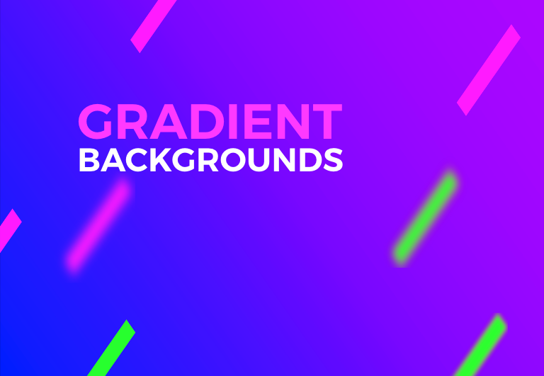
Gradient backgrounds are not new to web design, but with the evolution of CSS3 and animations, background gradients are here to stay. Using a gradient background with a subtle transition of color can bring the experience to life. Adding a gradient overlay over an image can give you a stylish look while keeping a color scheme no matter what the image colors. Also adding contrasting colored elements can add that extra amount of pop to your page.
EXAMPLE: https://codepen.io/jayjoomler/pen/WXgwvx
4. Split Screen Layouts
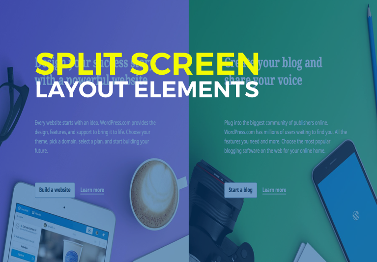
Colored backgrounds and split layouts are no newcomer to web design, in 2018 look forward to more split screen layouts with contrasting colors and a subtle distribution of elements that give the impression they still exist somewhere beyond the edge of the monitor. This trending style will take the place of pricing tables and multiple option pages.
EXAMPLE: https://codepen.io/jayjoomler/pen/KyxzVa
5. Vegan Navigation
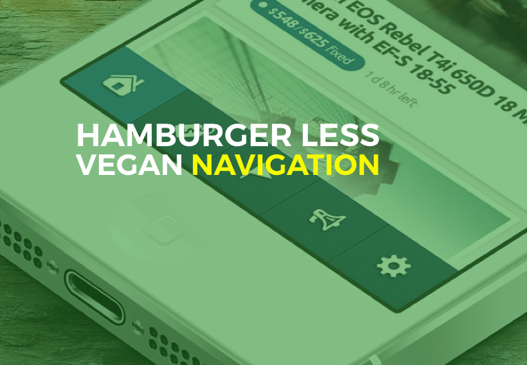
The hamburger menu has become the standard of responsive/mobile design, but let’s face it, not everyone wants a hamburger. The statement “You’re doing it wrong” couldn’t be more accurate when it comes to the hamburger menu. Over 60% of websites using hamburger menus place it on the top right of the header, where a user can not access it with one hand. How friendly is this? And why do we need to have some much real estate taken up by a sticky header just to provide a menu link? In 2018 bottom sticky navigation will become the new standard in mobile design, hamburger optional of course!

6. The Return of Mobile Templates
Responsive design and CSS Frameworks like bootstrap killed mobile templates, but the tide is quickly changing. A website that adapts to all screen sizes has been a time saver but doesn’t always give the mobile user the best experience. Apps have been one way to ensure the best experience, but not every website needs a mobile app. Mobile templates designed with an app like interface can give the user a robust and friendly mobile presence.
7. Knock Out Text
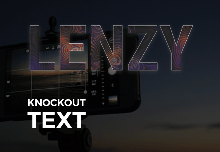
Knock out text has been a print design style for some time and CSS based knock out text has been available for a few years, but the use of animated gif’s and video are the new wave. Knock out text outlines the text that appears cut out, such that you can see a background behind it. Adding an animated gif or video in the background can bring the text to life.
EXAMPLE: https://codepen.io/jayjoomler/pen/XzPdKZ

8. Isometric Grids
The introduction of the Grid layouts and CSS3 has been with us for years now, but isometric dimensional grid layouts are just the beginning of things to come with CSS Grid. Isometric designs are created by placing skewed grids on top of each other.
EXAMPLE: https://codepen.io/jayjoomler/pen/gXdrmb
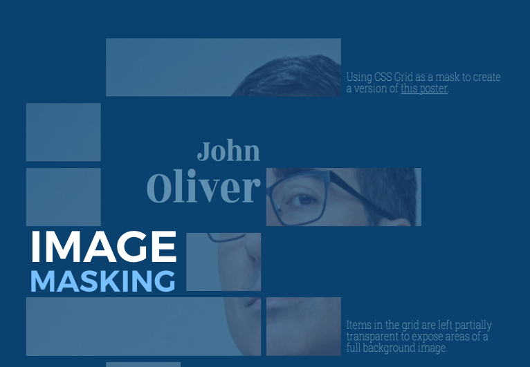
9. Image Grid Masking
Image masking is another style that has been with us for some time that will see a significant change in 2018. What used to take Photoshop skills or some complex Javascript is now simplified with CSS Grid layouts.
EXAMPLE: https://codepen.io/jayjoomler/pen/YEOqpb

10. Content is King
No matter what design trends or styles become the next big thing in 2018, Content will always be king.
2018 will undoubtedly be full of new trends and technology that will push web design into the future. From vocal search, VR, AR, and countless other technologies the web is set to make some significant changes in the coming years. Keeping up with the new technologies might seem to be a daunting task, but always remember.
Source: https://magazine.joomla.org/item/3284-webdesign-trends-of-2018


